Common Mistakes in Packaging Design That You Should Avoid

In order to accurately convey your brand's identity, packaging is crucial. Your package will be the very first thing a customer touches and sees.
30th May 2023 By Adosphere
In order to accurately convey your brand's identity, packaging is crucial. Your package will be the very first thing a customer touches and sees. Therefore, having the appropriate packaging and the "X" factor for the product's appearance will assist your venture into an untapped market.
What is packaging design?
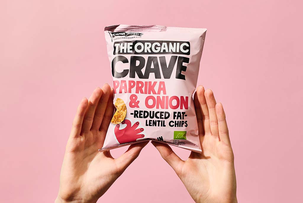
Packaging design is a process by which your packaging may perform a variety of roles. It must be capable of holding your goods as well as transporting and storing them. Form, structure, materials, color, imagery, and typography are all connected with design components in packaging design to create a product that is fit for marketing.
Your design should stand out from the packaging of your competitors in some way, as well as appeal to customers both in-store and online. However, no matter how simple something appears to be, it might often be difficult to understand. Stated below are certain don'ts that should be kept in mind while designing packaging.
Unnecessary waste: Packaging serves as a critical link between your product and the buyer. As a result, a product that is filled with extraneous materials and takes up too much space, sends out the wrong signals, making it difficult to communicate your message. The most significant feature is that it is a waste of resources. According to a survey by Cone Communications, 88% of consumers are loyal to a firm that promotes social or environmental causes.
Weak aesthetics: Brand aesthetics encompasses the overall look, feel, and style of a brand. What do you think when you look at something for the first time? It’s never its core features; it’s always the way it looks and how tangible it is. The brand's aesthetics also depend heavily on the quality of the materials used to package the product. Giving out the wrong aesthetics creates confusion and additionally damages the brand's reputation due to lack of recognition.
Inaccessible packaging: Imagine you just got your new smartphone, and you’ve spent the last 20 minutes trying to open the box. It’s tremendously embarrassing for the smartphone company, right? That’s why the first priority is always about how consumer friendly the packaging is, followed by the product itself. If the consumer cannot simply open the package, it is possible that they will not purchase your company's items again.
Lack of divergence: The market is really noisy. That’s why it's important for a brand to have a distinguishing product as well as packaging, without which it will be difficult to grab the attention of potential customers. It is much easier said than done, and it’s difficult to build a unique experience for your product while completing other duties.Packaging acts as a visual depiction of a product's identity and without a compelling USP, the packaging design may lack a distinctive visual language, making it difficult for buyers to differentiate it from identical products in the market.
At adosphere, we dive deep into the impact of an engaging package design that stands out from the crowd. To know more contact us today!


